Carbon Reach
🎒 the brief.
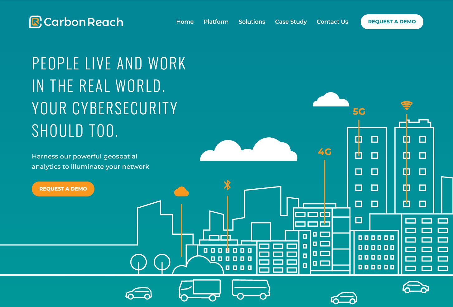
Innovative cybersecurity firm, Carbon Reach, specializes in geospatial analytics. Their request was simple. They wanted to showcase their expertise and stand out from competitors. The client shared their frustration of not being able to attract a lot of clients. It was up to me to help them transform their website through a total rebranding.
⚙️ the process.
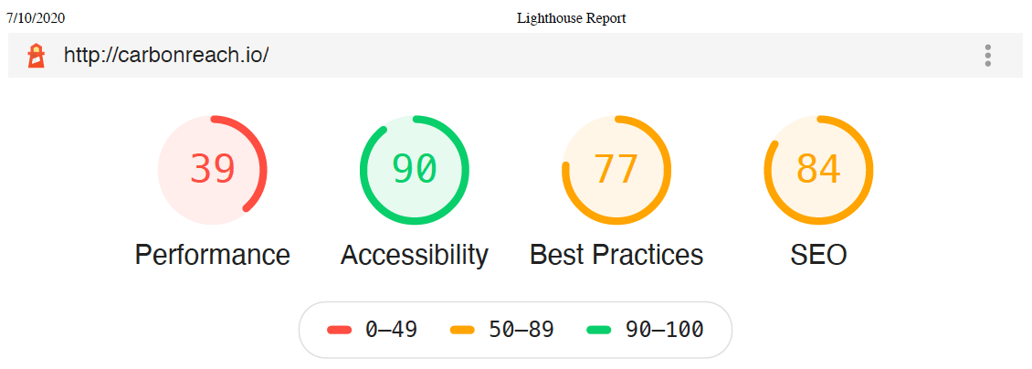
Carbon Reach’s in-house designer (Jeff) and content writer (Nicole) began creating initial UI concepts together while I was exploring the user divergence. Using data from Google Analytics I discovered Carbon Reach’s website ranked relatively low in SEO. Additionally, I discovered the website was only capturing user’s information through a contact form and not requiring it when user’s downloaded the Carbon Reach case study.
Together with their designer and content writer, we began iterating over the user interface concepts and fine-tuning the details. While the designer and content writer focused on creating a timeless, modern, and attractive website I focused on ensuring the tech would stand the test of time as well.
💡 the solution.
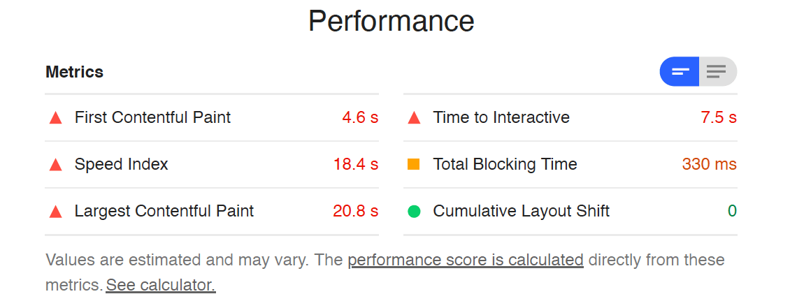
- Modernize the Carbon Reach website and make it blazingly fast
- Start collecting emails to read the Carbon Reach case studies.
- Use good search keywords and apply SEO best practices to improve rankings
💻 the tech.
Originally the website was created using Wordpress which is notoriously known for being slow and insecure. Wanting to create a fast website I decided to utilize Gatsby.js, a Static Site Generator, which would allow the website to adapt to their demands.
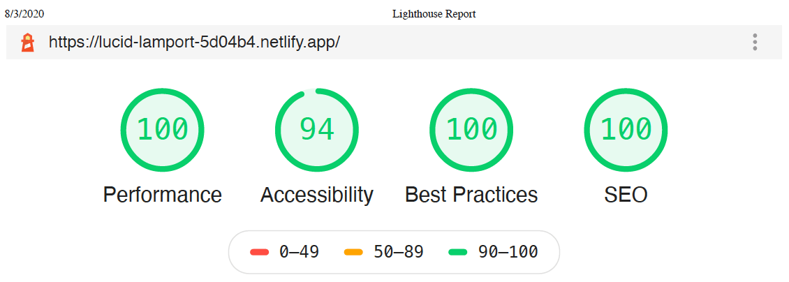
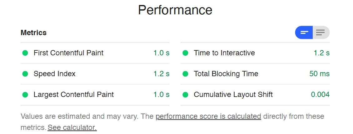
To further ensure the site would be quick, I wanted to cut down the network requests for CSS and JS assets. I did so by implementing reusable components, stripping out unused CSS and JS at build time using webpack, and running comprehensive checks for accessibility, performance, and best practices.
Additionally, I added a form using Formik to capture user information and integrating Google Analytics. While the user flow was changed to include a new data collection point, doing so allowed Carbon Reach the opportunity to follow up with these potential clients.
The last part of my strategy to improve the site consisted of setting up environment in Netlify to run through the Google Keyword Planner, ensuring the site was mobile-friendly, and optimizing images and assets.
✅ the results.
- A modern-looking, freshly rebranded site with new content that’s also blazing fast
- Increased demo requests because the Carbon Reach team has the ability to follow up with potential clients
- On the first page of Google search results (only under ESRi and IBM, which have twice the ad spend as Carbon Reach)
Overall the Carbon Reach team was ecstatic about the website rebrand and how their site is among some of the biggest hitters in the cybersecurity realm. I am very fortunate that I could help the Carbon Reach team in their endeavor.
