Clarity Innovations
🎒 the brief.
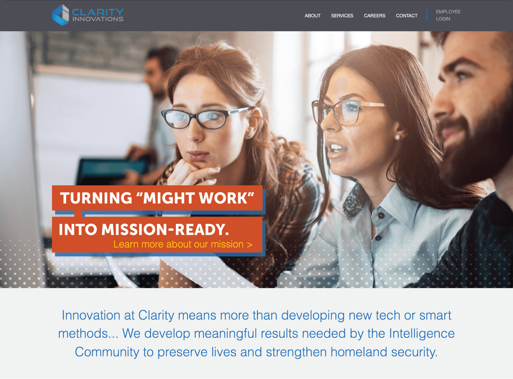
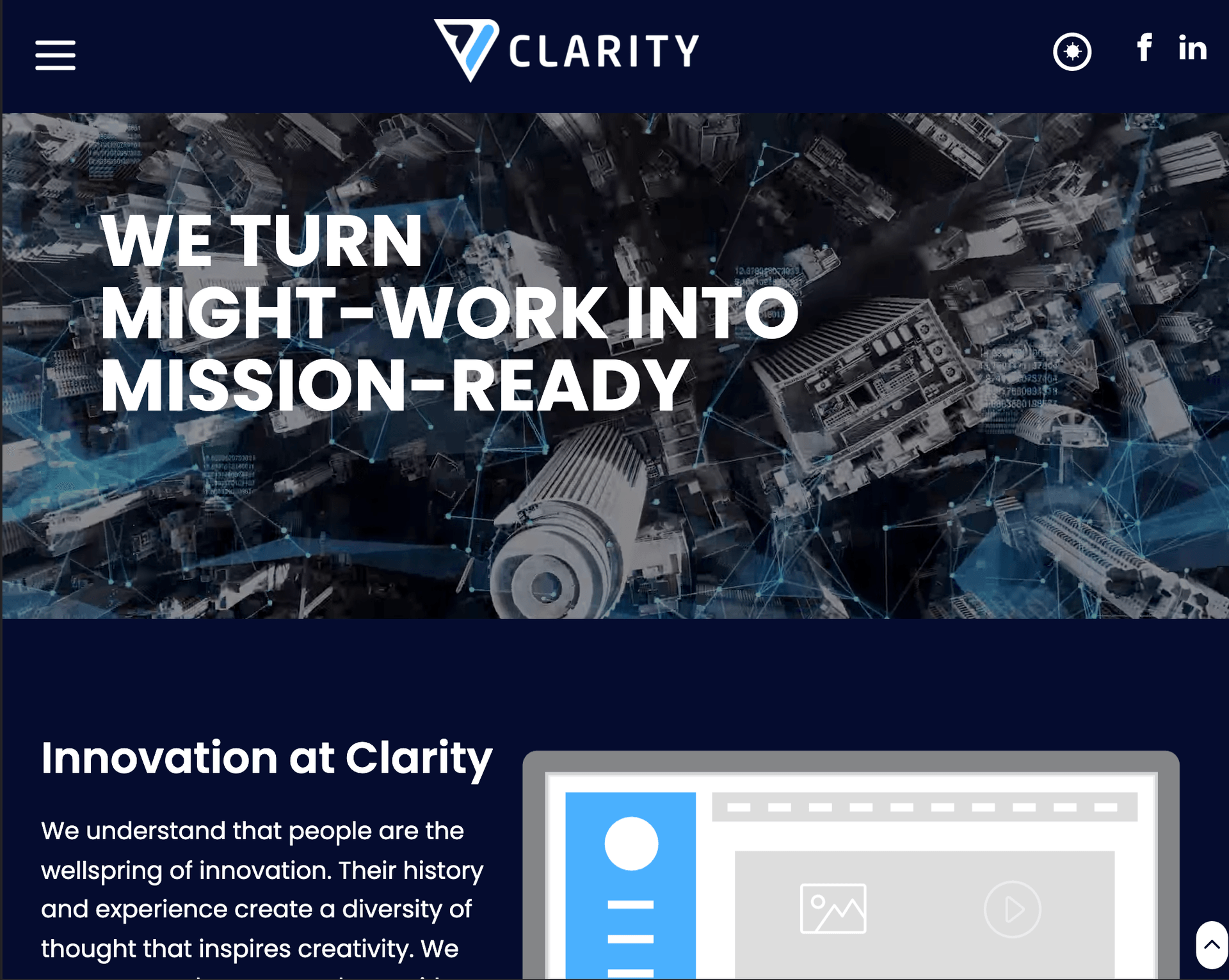
Veteran-owned small-business, Clarity Innovations, creates modern solutions for the government using its diverse skillsets. They challenged me with the ultimate task. They wanted to become “the standard” that competitors should achieve through mission, passion and determination. The client shared their hopes of being able to work with the best of the best and win big contracts. I took on the challenge of helping guide them in a website rebrand.


⚙️ the process.
Documenting and reviewing the current site’s information architecture was my first task. Clarity’s resident Art Director (Zoe) and I worked collaboratively in Adobe XD on the concepts. Together we created Clarity’s preliminary design system by make a UI inventory collecting patterns, colors, typography, and icons. After the UI components were cataloged I began conducting an SEO audit of the current site while Zoe and Nicole (Content Writer) continued to work on Clarity’s voice and tone principles.
After the prototypes were built we began systematically reviewing these assets to ensure the designs, voice, and technology meshed well together. When two pages of the web prototypes were approved by our team and Clarity’s leadership, I began to focus on starting building out the site. One interesting challenge was figuring out how to integrate their Jobvite career listings within the React ecosystem (original was an iFrame with set width and heights)
As the project was nearing completion and deadline fast approaching scope creep set in when two new features were requested: the inclusion light and dark color schemes and the addition of complex animations.
💡 the solution.
- Modernize and rebrand Clarity Innovation’s website
- Create a extensible rule framework based on the design system
- Apply SEO best practices to ensure top rankings on Google
💻 the tech.
The website was originally built with just HTML by a third-party web design team and served via Node. Because of the short deadline I decided to utilize Gatsby.js and TailwindCSS which would allow the site to be extensible while allowing me to have higher throughput.
The creation of an extensible rule-based framework for future developers became a priority. This mainly consisted of setting up ESLint + Prettier to be run on commits and accessibility checks on web best practices are followed. Creating ESLint rules and Axe (core) and integrating them into git hooks using Husky. Additionally, setting up Storybook to catalog our UI components and how they work. This was to ensure developers had guidelines that could be adapted towards future requirements.
Unlike the current TailwindCSS that has dark color schemes enabled, I had to figure out a way to enable light and dark scheme switching by myself. What I came up with was to use React’s Provider/Context method to update CSS variables conditionally. The other challenged with the complex SVG animations I opted to using Lottie files to help save development time and meet the deadline.
✅ the results.
The creation of a newly branded, modern-looking, website that contains SEO-friendly content. Since the rebrand Clarity was able to win more partnerships and contracts. One that I am most proud of is because I tirelessly worked to launch the new Clarity site on-time, the business was able to win a $950 million-dollar government contract.
